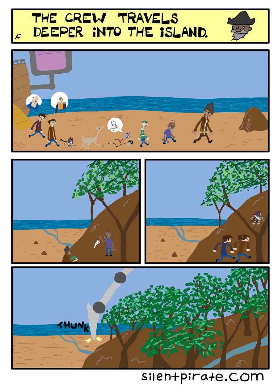
Based on the feedback from last update, it sounds like this art style might still need some getting used to. I’ll be asking once more in a couple of weeks if you guys changed your opinion on it.
(Also, there’s going to be one last art style shift for a portion of this chapter, but it’ll only last a few pages)


I like it, though I question the size of these characters relative to their environment (less so, relative to each other), especially in the first panel. As an artist, I hesitate to repeat constructive criticism I’m not particularly fond of receiving myself, but omitting the detail of outlines makes things harder to recognize at a smaller scale. I thought it might be helpful to mention it, which is the only reason I am bringing it up.
Thanks for the criticism! Managing size relationships has always been an issue for me (and this page was drawn in a bit of a hurry, which exacerbated it). Now that I look at it again, you’re right, all the characters are of wildly differing sizes, and they do blend in to the sand. I might have to redraw this page…
Monkeylord!
Five things I noticed:
This is the first time we have seen the twin’s eyeballs.
Pluto is smaller then I thought when compared to the others.
All the said memes tie in with who the character is(though I’m not sure about Ignacio’s).
I’m not sure if you know, but the order of chapters on the screen’s side is out of order.
And finally, that last panel is pirate hunter Uranus. Calling it now.
I don’t mean to sound like a critic, don’t take it that way! 😮
Nah, I need criticism, besides, as long it’s constructive! To reply to your other comments:
1) It’s hard to see at that size, but their eyes are confused spirals, like when a Pokémon faints. So, no we still haven’t seen their eyes!
2) I did a rush job when drawing this, and all the sizes are a bit off. He’s supposed to be about as tall as Wyatt, who’s a little shorter than Silent Pirate.
3) Most of the times the meme fits with the context. Ignacio’s, though, was me choosing an ironic meme (There’s certainly plenty to do in Meme Island)
4) Yeah, Comicpress orders it alphabetically. I’ve been procrastinating with doing a big website overhaul…I’m a little worried I’ll break something!
5) Dare I ask why you skipped Saturn? (That said…yes, it’s Uranus)
I try to offer criticism in a friendly way, it’s just they way I typed it is that it sounds more like a frank critique.
1) At second glance…they are spirals! I was looking at it from my tablet before, now I’m looking at them from a computer screen. Darn!
2) Again, more criticism: I have to agree with Tachyon on this one. The size relationships have gotten a bit wonky before(like in the Jupiter arc). And though I like the new art style, not having outlines makes it a bit hard to read. Not that I have super-bad eyes that can’t see without the outlines. I do like the little streak details and vibrancy(?) of this art style.
3) Yeah, I mean Peter’s and Kaia’s meme-matchups are spot-on. I was thinking maybe that Ignacio’s was referencing to that the there was ‘nothing to see here’ on the boat in comparison to the curiosity that the island piques. That or he was using a meme for the strange emptyness of island animal life.
4) If it was my comic, that would bug the crap out of me. I like being more organized in sorting things.
A website overhaul? Would you be changing to a different host completely, or just organization?
5) Well……remember that concept idea I came up with for Saturn/Uranus? Let’s just say that we were both in the right mind for making Uranus with giant…..insect legs. My idea is a spider in reference to Uranus’s symbol.
2) I do need to get a handle on the size variations…
3) The island isn’t empty of animal life, by any means!
4) Just the organization/color scheme. This conversation’s lit a fire on my rear, so the beautification process has already started!
5) Uranus is actually spidery, sort of!
2) Don’t get too down on yourself. If you’re using photoshop, not try drawing each character on a different filter, then resizing them to scale, and adding details?
On the other hand, that might produce different results then just drawing them to scale, though…
3) I wouldn’t expect it to be empty, given that it’s home to all memes!(and a giant pirate hunter or two.)
4) I never had any intention to lighting your rear on fire! I probably sound unsatisfied, but I am definitely not! Sure, color would be nice, but I’m not the guy to go around complaining about it. I’ve always enjoyed your comic this way!
5) Nice. I got pretty close then, my concept isn’t all spider in a way. The legs on Uranus are different then mine, and my Uranus is not so titanic.
I think this new style is looking pretty rad … there’s nothing wrong with experimenting a bit, it definitely leads to constructive growth and experience. I say keep it up as long as you’re happy with it! it’ll only lead to more growth in the future!
Thank you, Rogers! I can only hope it’ll lead to stronger art…